Clever Jane
While operating as Swag Design Factory & Swag Print Factory, Liz Parsons and her team had worked to develop beautiful, personality-driven brands for more than 15 years. As the business evolved and a longstanding creative partnership solidified, the time felt right to branch out on her own, separate from the print side of the business. It was time for a new name and identity; one that captured the spirit of her new business venture.
The Challenge
Embarking on a rebrand with an established identity and reputation comes with its own set of challenges, but it also presents a tremendous opportunity to make an impact. It was crucial to convey the team’s talent and depth of experience, while capturing the essence of their new business model. It was important to let the values and beliefs that were driving the rebrand to guide our work.
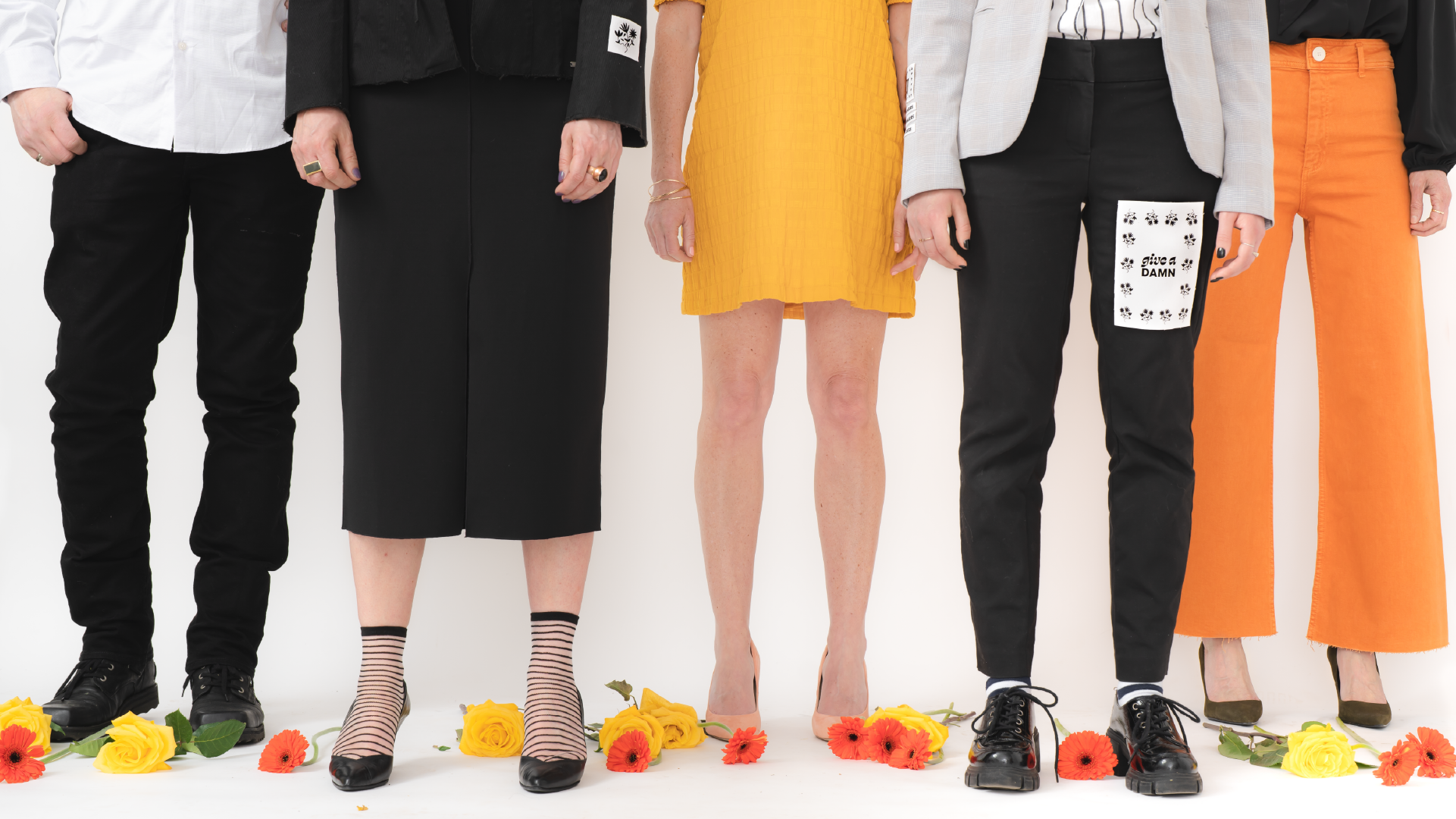

Her Name is Clever Jane
Landing on a meaningful name demands a deep dive into the foundational truths of a business and the story that drives it. We played with concepts, looking for adaptability, availability, and potential. More than anything we were after the intangible pull of “the one,” which becomes clear when the process is guided by clear-eyed strategy. Clever Jane is contrast personified: romance with a little goth edge, softness grounded by strategy; tradition and experience reimagined. By incorporating all of these concepts into the brand messaging and making sure it aligned with the visual story, Clever Jane was brought to life in a vibrant and completely original way.

When Your Brand Speaks Your Truth
Your People Will Find You.
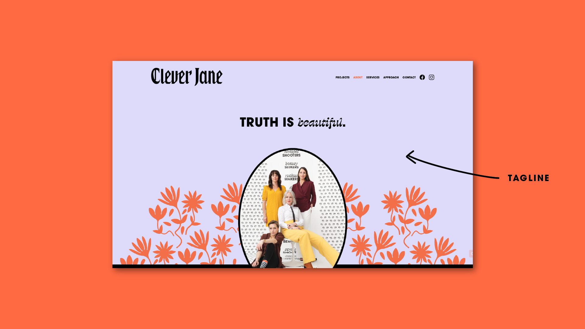
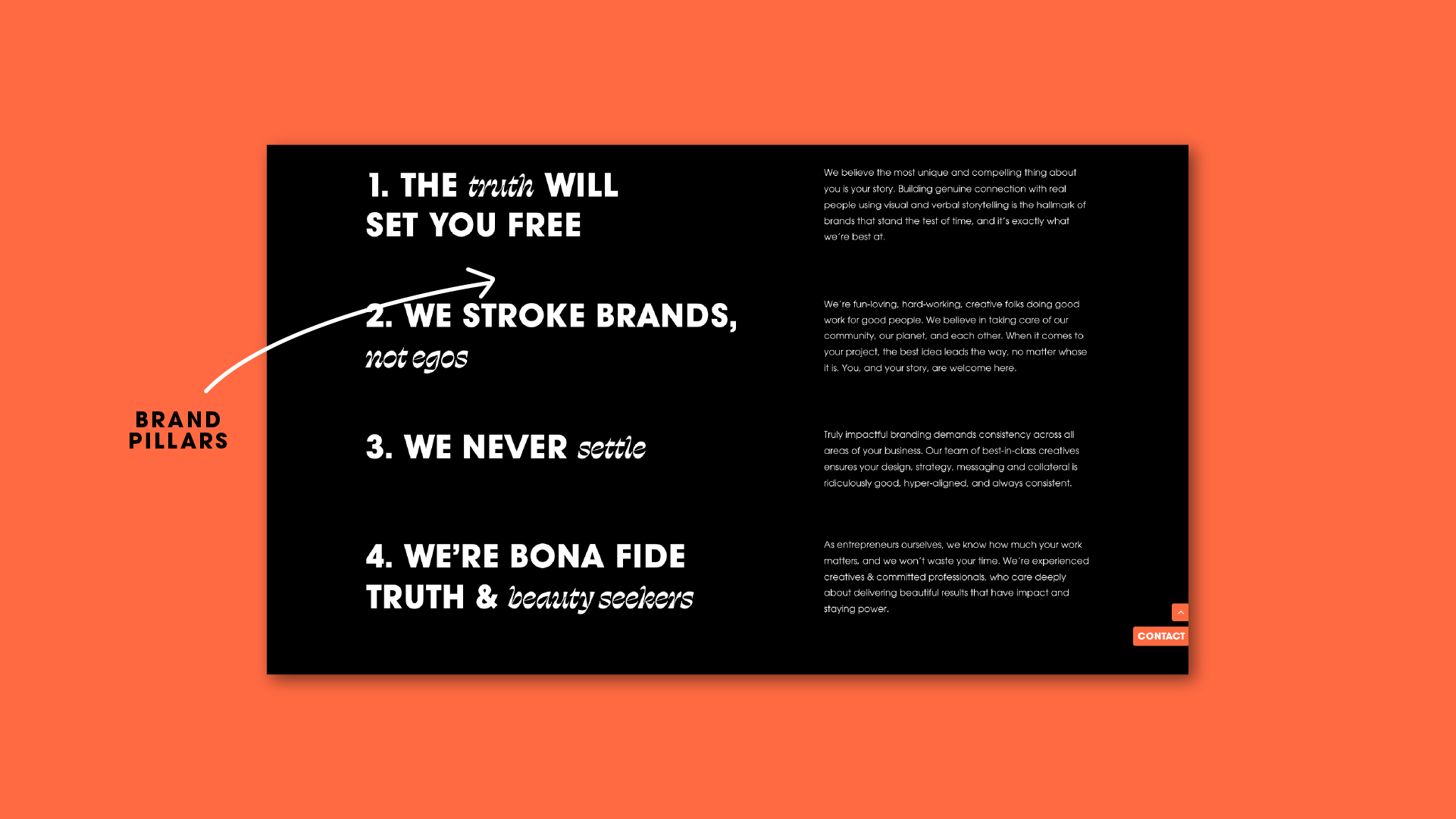
From the get-go Liz was very clear: she wanted to lead with her values, and she wasn’t afraid to be honest and vulnerable when it counted. This led us to her new tagline, truth is beautiful, and set the tone for all of her brand messaging to follow. By working through our foundational process, we established Clever Jane’s brand purpose and brand promise: we build powerful brands for the bold and the brave. Along with five brand pillars, this framework articulates who clever Clever Jane is and what she stands for.


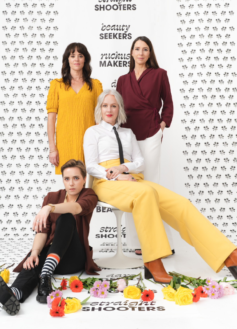
A Majorette and Clever Jane Collaboration
A Special Thanks To
CLEVER JANE — cleverjane.ca
PHOTOGRAPHY — @josilynkilbornphoto
MAJORETTE — brand naming, brand messaging, strategy, content & copy writing
Marget Milne & Elizabeth Hewitt
CLEVER JANE — art direction, strategy, identity design, web design & development
Liz Parsons, Emily Kiana, Barry Begus
