The Salty Woodsman
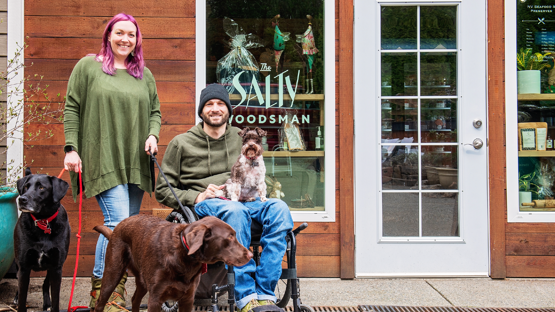
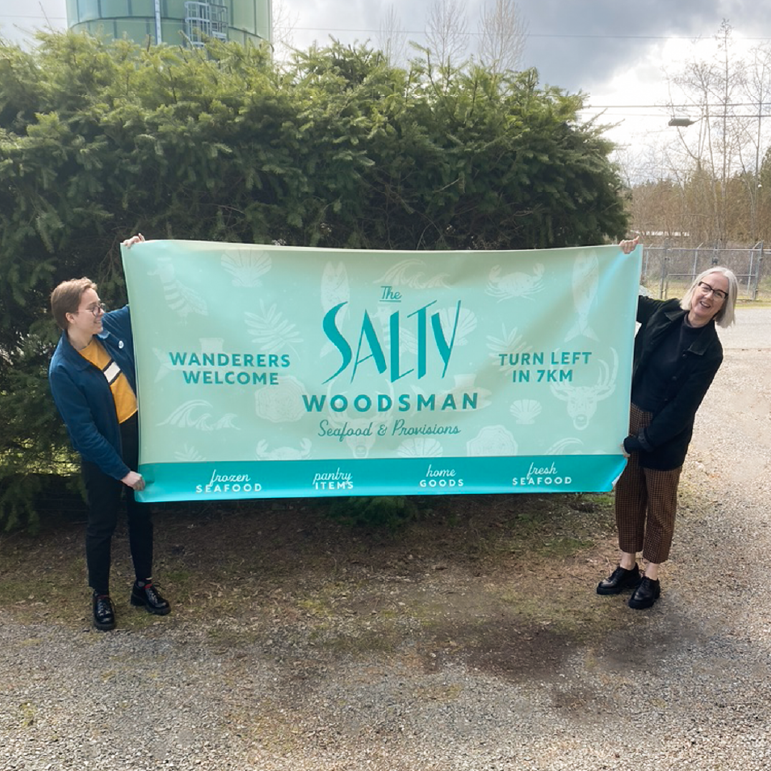
Nile & Nadine of NV Seafood were facing an uphill battle: a name that didn’t accurately reflect them, an unusual location, an eclectic assortment of goods, and a need to tempt tourists and locals alike off the main drag. They knew once people found them, they’d return time and time again, but they weren’t sure how to get them to take a chance and make that left-hand turn off the highway.
The Challenge
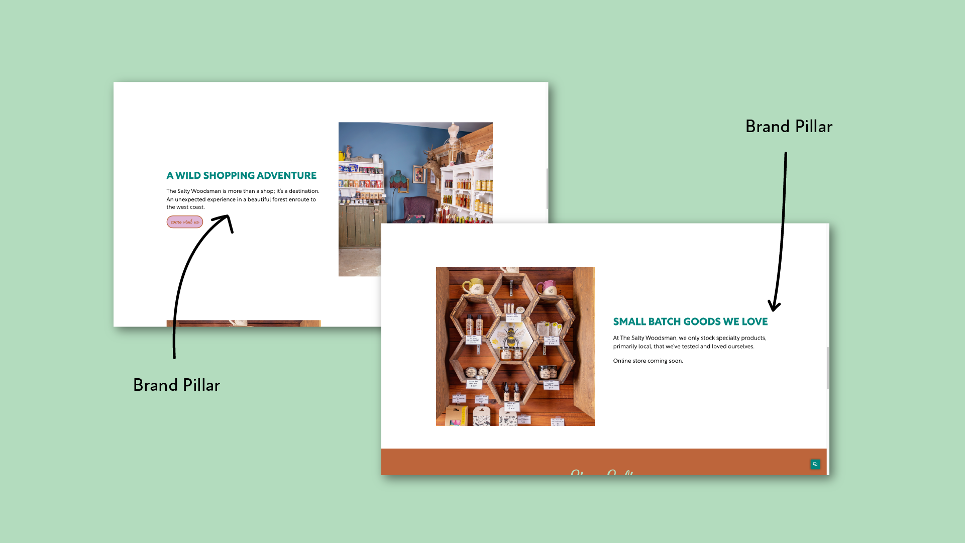
Being tucked away in the forest is beautiful, but not exactly ideal for attracting new and repeat business. They wanted to become a cult favourite, must-stop destination for people enroute to the west coast, and a regular hit for ‘in the know’ locals. To do this, we needed to make it very clear who they were, why they do what they do, what they sell, and how to find them. We also needed to breathe some life into their brand so it was as fun, genuine, and quirky as they are.
What’s in a name?
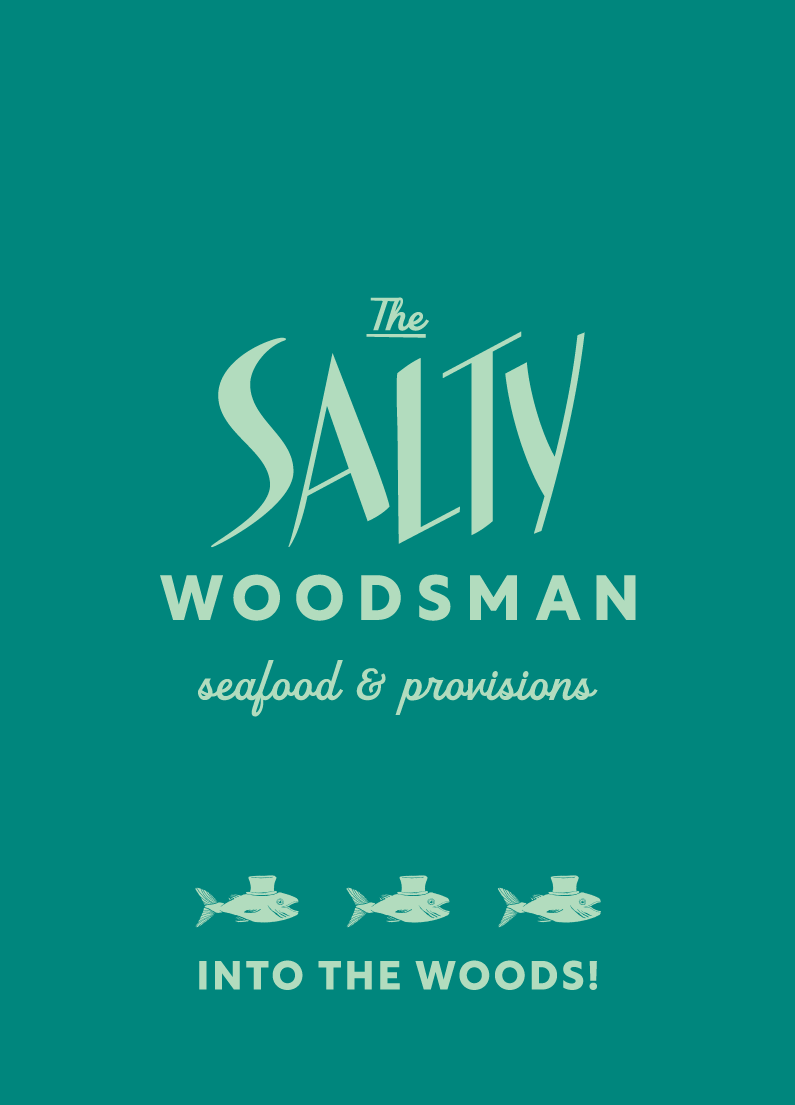
Renaming a business requires a deep understanding of the people and purpose behind the brand, and a clear idea of the target audience. We worked with Nile & Nadine to get to the heart of their story, and after some deliberation, we narrowed it down to a shortlist of contenders. The Salty Woodsman was a clear frontrunner from the start. Not only does it evoke their literal woodland location, it’s a subtle nod to Nadine’s German roots, and manages to suggest seafood while capturing the vibrancy and cheeky realness they’re known for.
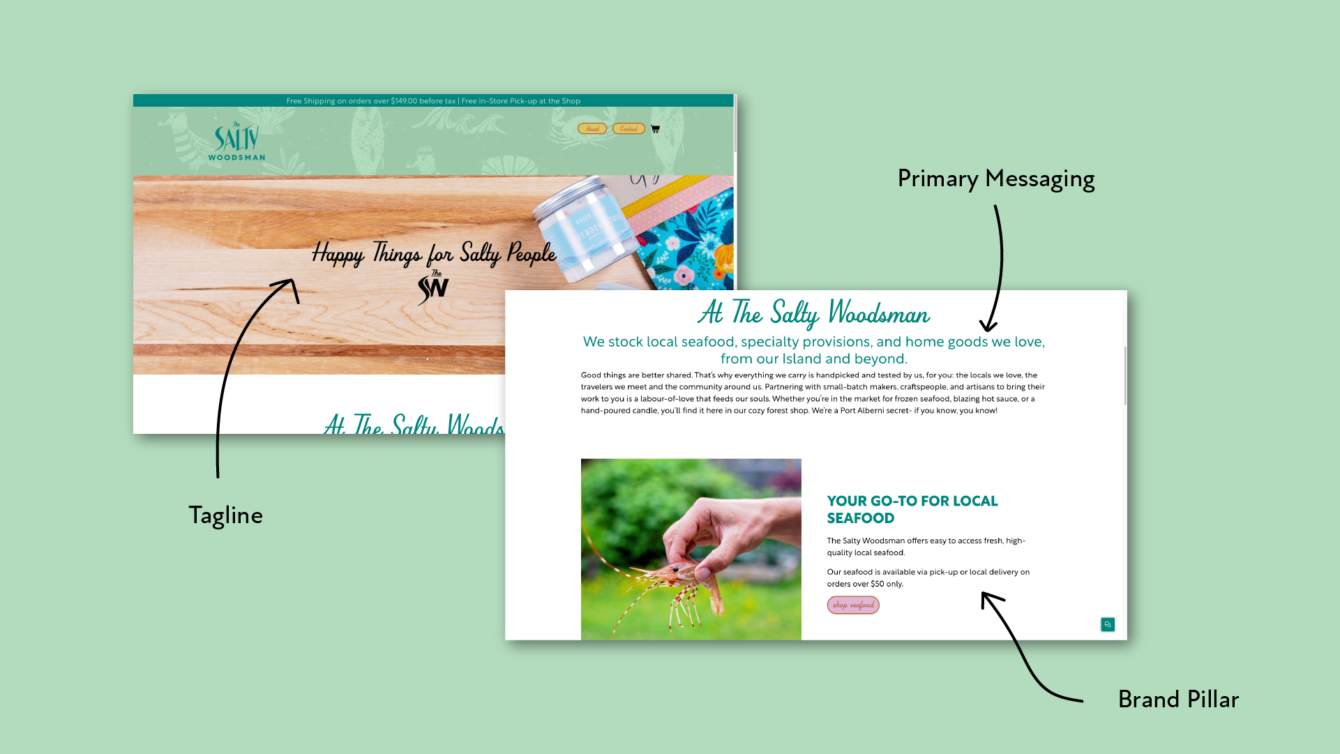
Happy Things for Salty People
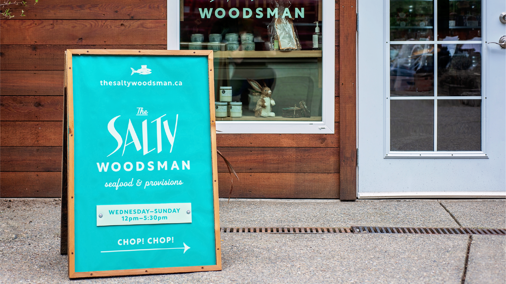
With inspired visuals and one-of-a-kind illustrations that included pipe smoking seagulls and fish in top hats, we needed to create language that echoed the quirky sentiment of the brand, without sacrificing functionality. We aimed to strike a balance between succinct, informative and suitably salty. By being consistent and creative with their messaging the end result is a charming sense of place and people- a perfect example of words and visuals working beautifully (and strategically) together.



Testimonial
We love the name and we love “happy things for salty people’. It is unique, fun, and it stays in the minds of our customers. The discovery process showed you really wanted to get to know us and what we stand for in-depth. You did a perfect job of capturing the spirit of our store, the name, the brand messaging, the tagline is 100% us.
Nile & Nadine — The Salty Woodsman
A Majorette and Clever Jane Collaboration
A Special Thanks To
NILE & NADINE — @saltywoodsman
PHOTOGRAPHY — @danikasea
MAJORETTE — brand naming, brand messaging, strategy, content & copy writing
Marget Milne & Elizabeth Hewitt
CLEVER JANE — art direction, strategy, identity design, web design & development, merch, signage
Liz Parsons, Emily Kiana, Barry Begus
